Of the poems I have written & printed, “Persephone’s Poem” will always be a favorite. It reminds me of my days as a young Librarian when a philosophy professor visiting the library* recommended I read Roberto Calasso’s The Marriage of Cadmus & Harmony, a paean to when the Gods still walked in the garden in the cool of the evening, and sat at table, and broke bread with men and women – a time when the veil that separates the sacred and the profane could still be pulled aside.
“God possesses the heavens but covets the earth.”
It started me on a a several years-long classics kick, and I found great joy in reading books that as an adult I found rich & rewarding when as a student I would perhaps have seen as an assignment to be completed. Part of that reading included Allen Mandelbaum’s translation of The Metamorphoses of Ovid, which led me to write this poem, a little love scribbling by the King of the Dead for his melancholy bride, she who brings us the seasons.
Wm. Morris was a man who loved a good text block. If he did not like the way a page flowed visually, he would rewrite it, not as author as editor, but as author as visual artist. I get it. An unsightly space between words is an offense. And don’t get me started on poetry. Really, there is nothing worse than setting verse, with its raggedy edges. Not even with the intersession of St. Augustine does it ever looked centered on a page.
Ah, but a text block, a thing that can be measured and centered and AlignMated. It is a thing of beauty. I knew that visually when I set ” Persephone’s Poem” I wanted it in a justified block. I wanted to use a decorative initial. And I wanted to use my 18 pt. Centaur I had just purchased from M & H Type.
Then the whack-a-moling began. Those of you of the keyboard generation know that justifying type requires highlighting the text & then choosing the justify icon. With hand-set type, each space between a word needs to be filled with a physical space, an em or an en or a 3-to-em, and adjusted with a thin space or a hair. Each space is a decision. Once you have the width of your text block, the lines will run either long or short (or occasionally, and again with the intersession of St. Augustine, just right). The only way to make a long or short line meet the standard length is to increase or decrease the spacing between words. The longer the line, and the smaller the type, the easier the justification.

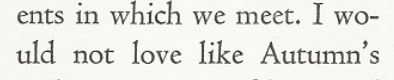
With “Persephone’s Poem’” I had decided on a 2 1/2″ wide text block and was using 18 pt. type. I had only a few words per line and thus only a few spaces between words that could me shortened or lengthened. And slowly I realized it couldn’t be done. No matter what combination of spacing I used, there was no way lines 6 & 7 – Summer’s heat, stealing mom-/ents in which we meet/I would – could fit in that narrow a text block. And thus I was defeated.
But did I buy a 1200 lb. cast iron letterpress so that my life would be easy? No! Did the great printers of the Incunabula, Gutenberg and Zainer and Jenson and Ratdolt and Aldus and Caxton, follow rules? No! Do I remember anything Sr. Joan taught me from the Harcourt-Brace-Jovanovich grammar book at St. Francis Elementary School? No!
So I went there. I hyphenated a one syllable word.
Now when I raise a prayer to Augustine, the Patron Saint of Printers, he just shakes his head and refers me to Jude, the Patron Saint of Lost Causes. But up in Printer’s Heaven those bearded men with blackened fingers raise a pint. They know I done good.
*Alas, a professor in the library is a rare sight these days. When I tell the younger librarians this story I believe they see me as a bit of a fabulist, having no first-hand experience with professors in the library. Although one librarian, who had worked in a different academic library previously, tells the tale of “Dr. Demando,” a history professor who shows up once a year at the the same time of the semester at 7:56 a.m. sharp, demanding the same video for his 8:00 a.m. class.
[Editor’s Note: While Mr. White is too modest to state this in his post, in the year 2000, when he printed “Persephone’s Poem,” he sold 4 copies. At $25 per print, that netted him $100, which, without a doubt, made him the highest paid poet in the State of Minnesota for that year. An accolade he does take great pride in].
SOURCES:
Anon. “God possesses the heavens … [Irish folk saying].
Calasso, Roberto. The Marriage of Cadmus & Harmony. New York: Knopf, 1993.
Lynch, Lindsay. “How I Came to Love the En Space.” The Atlantic, 16 Sept. 2016.
Mandelbaum, Allen. The Metamorphoses of Ovid. New York: Harcourt Brace, 1993.
Morris, William. A Note by William Morris on His Aims in Founding the Kelmscott Press: Together with a Short Description of the Press by S.C. Cockerell, & an Annotated List of the Books Printed Thereat. Hammersmith: Kelmscott Press, 1898.
Turner, Berry W., and W. P. Jaspert. The Encyclopaedia of Type Faces, 3rd Ed., further revised and enlarged. New York: Pitman, 1962.

Leave a comment